21 Cartography
The sphere is a 2-dimensional object (its inside is three dimensional, but remember the geometry that concerns us is only the surface), but so far we have been studying it using the three coordinates of Euclidean 3-space in which it lives. This is sometimes incredibly convenient - it let us describe the geodesics of the sphere in a simple way as intersections of \(\SS^2\) with planes, for example. But in other respects it causes extra complication: functions now have three variables, meaning their derivatives are \(3\times 3\) matrices (containing 9 numbers), when they we should only require \(2\times 2\) matrices (four numbers, less than half!) if we could find a way to really work with the sphere intrinsically as a 2D object.
While the number of variables alone certainly increases complexity, worse computational woes are caused by the fact that the cartesian \(x,y,z\) of \(\EE^3\) just aren’t a good fit for the sphere they are well adapted to describe straight objects like lines and planes, but the sphere bends in all three directions, making it so that even using symmetry we can’t move things around until something turns into a 1-dimensional problem (the best we can do is move something to a great circle that lies in a coordinate plane, like the equator, which sets one variable to zero).
This makes certain computations prohibitively difficult: you may recall that so far out of the three properties we claimed equivalently define geodesics, (length-minimizing, zero acceleration, and fixed by symmetries), we have actually only proven the latter two to be equivalent. The reason is simply that dealing with length integrals of the form
\[\int_a^b \sqrt{x^\prime(t)^2+y^\prime(t)^2+z^\prime(t)^2}\,dt\]
lead to some pretty long calculations, and massively increase the complexity of actually doing a the calculation, leading to some pretty unenlightening pages of integrals.
But the good news is, there’s another perspective on spherical geometry which addresses these shortcomings of the \(\EE^3\)-based-approach.
- Its naturally intrinsically 2-dimensional, dealing only with 2D vectors and \(2\times 2\) matrices.
- It allows (some) geodesics to be described in a simple way, making various length integrals more tractable.
- It can be drawn on a chalkboard or in a notebook, so I don’t have to lug a physical sphere up and down to the fourth floor for each class!
And the best feature of this new approach to geometry is that we are already familiar with it - humans have been using it to represent spheres since antiquity. It’s the study of maps.
In this chapter we will look at some historical examples of maps, try to discover the underlying mathematical concepts that tie them all together, and then look at one (particularly simple) map as an example, to see how calculations are done.
21.1 Examples
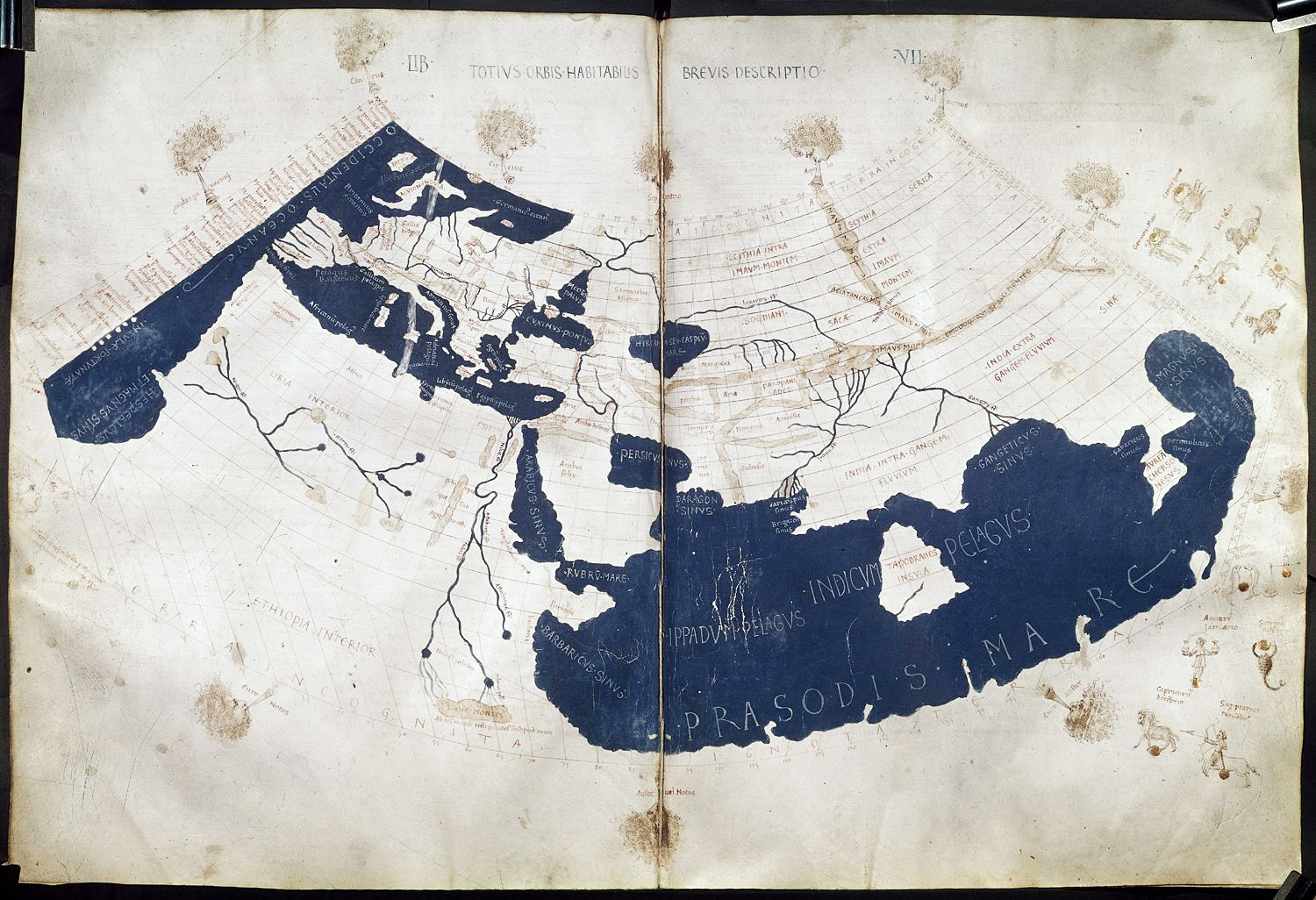
The idea to try and accurately portray regions of the spherical earth on a portion of the Euclidean plane dates back to antiquity, and in the 2nd century CE Ptolemy wrote a book - Geographica containing a prescription of coordinates for map-making, and a map of the known world (the Mediterranean basin).
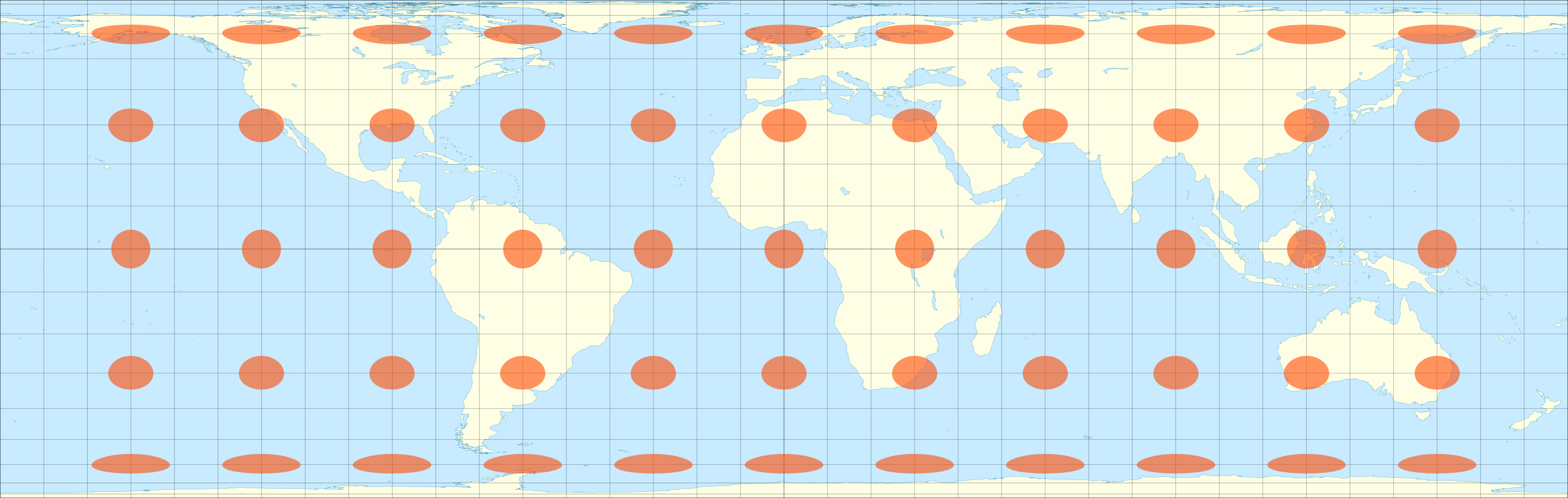
Over the intervening centuries many hundreds of different map-making styles have been created, with each map specifically designed to serve certain purposes best. Perhaps the most famous map is the Mercator projection, designed in 1569 by Gerardus Mercator (whose real name was Gerhard Kremer):
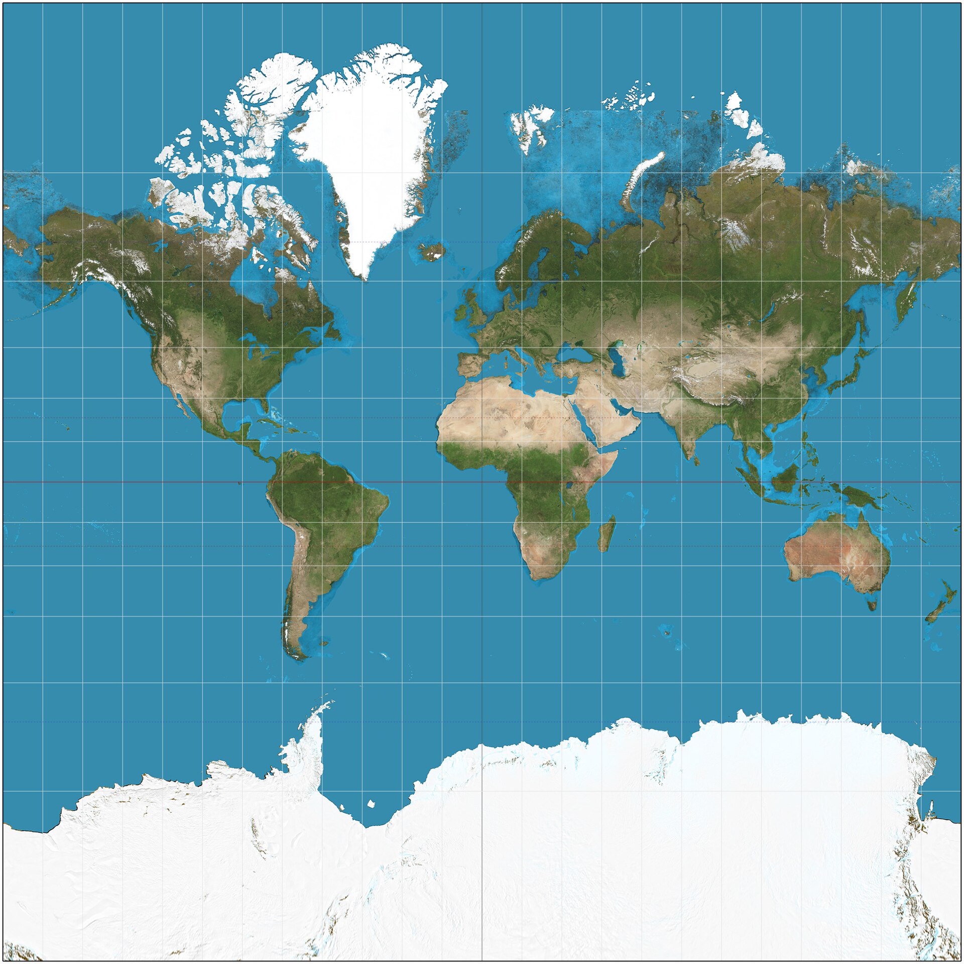
This map was originally designed to simplify navigation by ship: it has the very useful property that any angle you measure on the map accurately reflects the true angle value on the globe (more about this, later).
While this map became famous for preserving angles, it is also infamous for not accurately representing areas. In reality Africa is a gigantic continent (the United States approximately fits just into the Sahara Desert!), but here it appears to be about the same size as Greenland: an island which is actually fourteen times smaller. To appreciate the amount of distortion here, we can look at an overlay of each country with an accurately-sized version of itself.

To interact with such a graphic in real time, visit the website https://www.thetruesize.com/, which allows you to choose a country to drag around the mercator projection, and see its true size relative to other countries on the map!
Of course, its natural that there’s distortion to the shape and size of regions on the map: we are trying to flatten the curved geometry of the sphere into a region of the plane! After we’ve developed a bit more mathematical material, we will prove a theorem to this effect. To help visualize the distortions of map, French mathematician Nicolas Auguste Tissot introduced the drawing of small disks on a map - representing the images of small uniformly sized circles on the earth. Such a shape is now known in map-making as a Tissot’s Indicatrix (plural: Tissot’s Indicatrices).
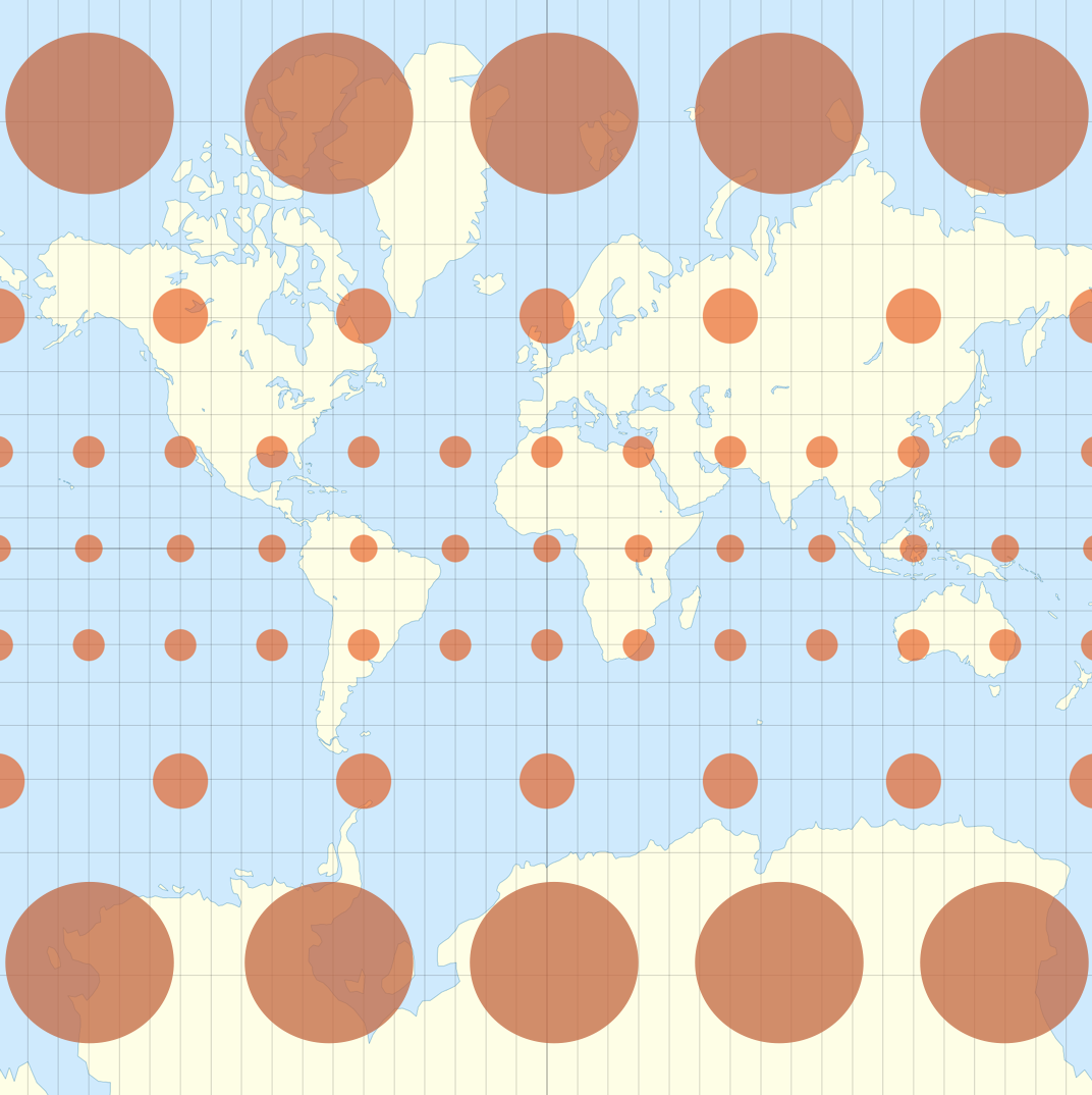
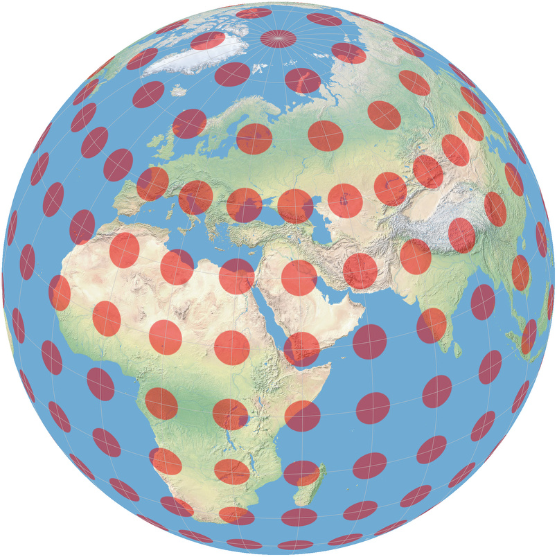
The pairing of a map with Tissot’s Indicatrices gives a helpful way to both visualize the earth while simultaneously being aware of the distortion incurred by this projection. We will adopt this as good style throughout the rest of the text, and anytime we draw a new map for the first time, we will accompany it with Tissots Indicratices (though once we start into the mathematics, we will leave this mapmaker terminology behind and start calling them map disks, or infinitesimal disks).
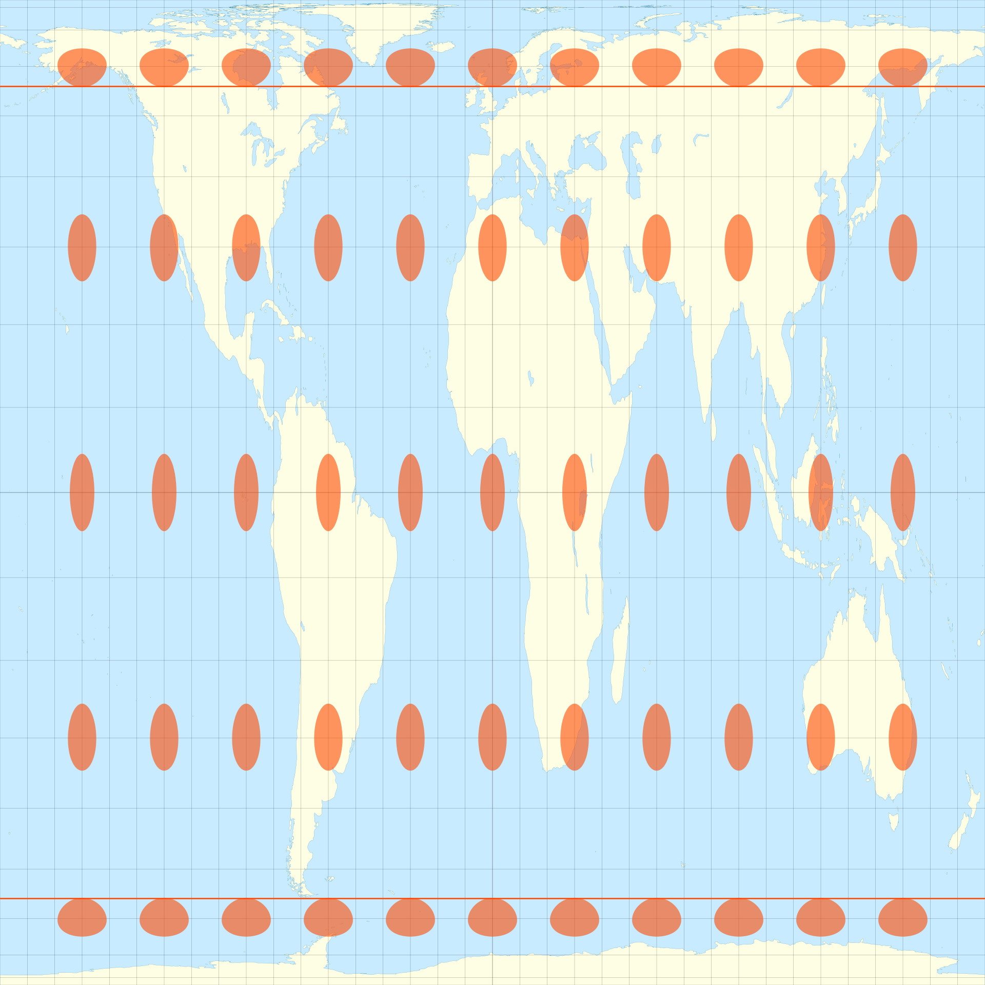
A natural question after seeing the Mercator map is, can you find a map that doesn’t mess up areas so much? And indeed, you can! The map projection below is attributed to John Lambert in 1772 and is usually called the Lambert Cylindrical Projection, but the key idea traces back to Archimedes!

The Archimedes/Lambert map preserves the area of all regions, but it does so at its own cost: now angles are distorted! Recall that each of Tissots Indicatrices represents a small perfect circle on the globe - so the fact that these are being represented as thinner and thinner ovals near the poles means the map is stretching much more in one direction than in the other.
There are all sorts of area-preserving maps like this. The Archimedes/Lambert projection leaves the area near the equator relatively undistorted, but stretches horizontally near the poles. Instead, the Smyth projection manages to conserve area by stretching vertically inside the tropics, and horizontally outside:

This vertical stretching makes a map wtih smaller aspect ratio, and this trend can be continued: the Tobler projection stretches most of the earth vertically and only the arctic circle horizontally, to make a map which is a perfect square:
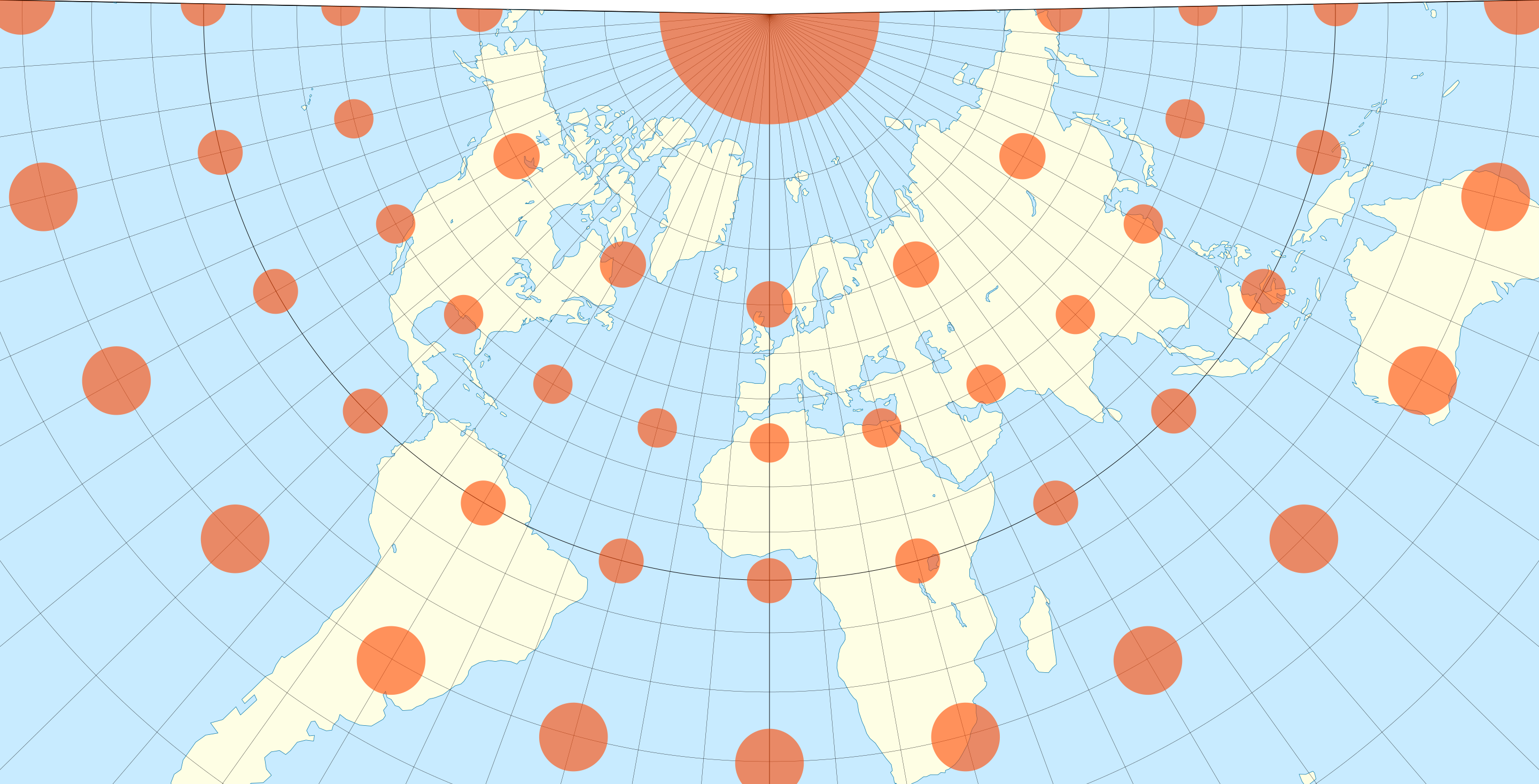
There are also other map styles which choose to preserve angles (like Mercator), such as the Lambert Cone Projection
or the Pierce Projection which does unequally display area, but attempts to arrange it so the big distortions happen out at sea, and do not affect the landmasses as much.
Another map in this category is stereographic projection, which will be the most important map of all mathematically (see the future chapter by the same name). Having drawn Tissots Indicatrices, you can easily tell these maps scale distances non-uniformly over the globe, but at each point scale all distances by the same amount, as circles are sent to circles!
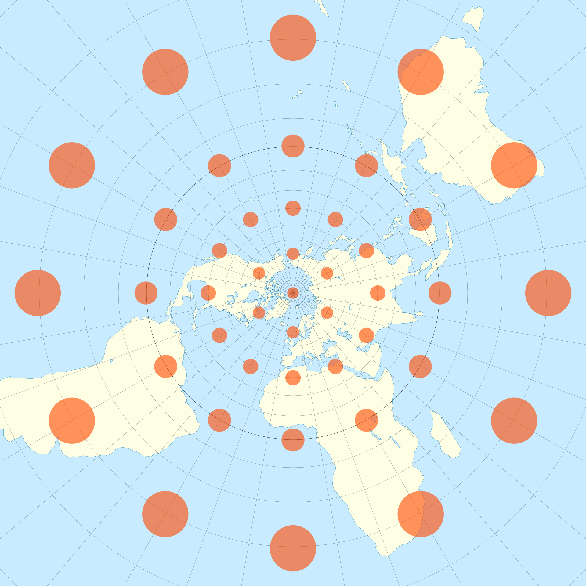
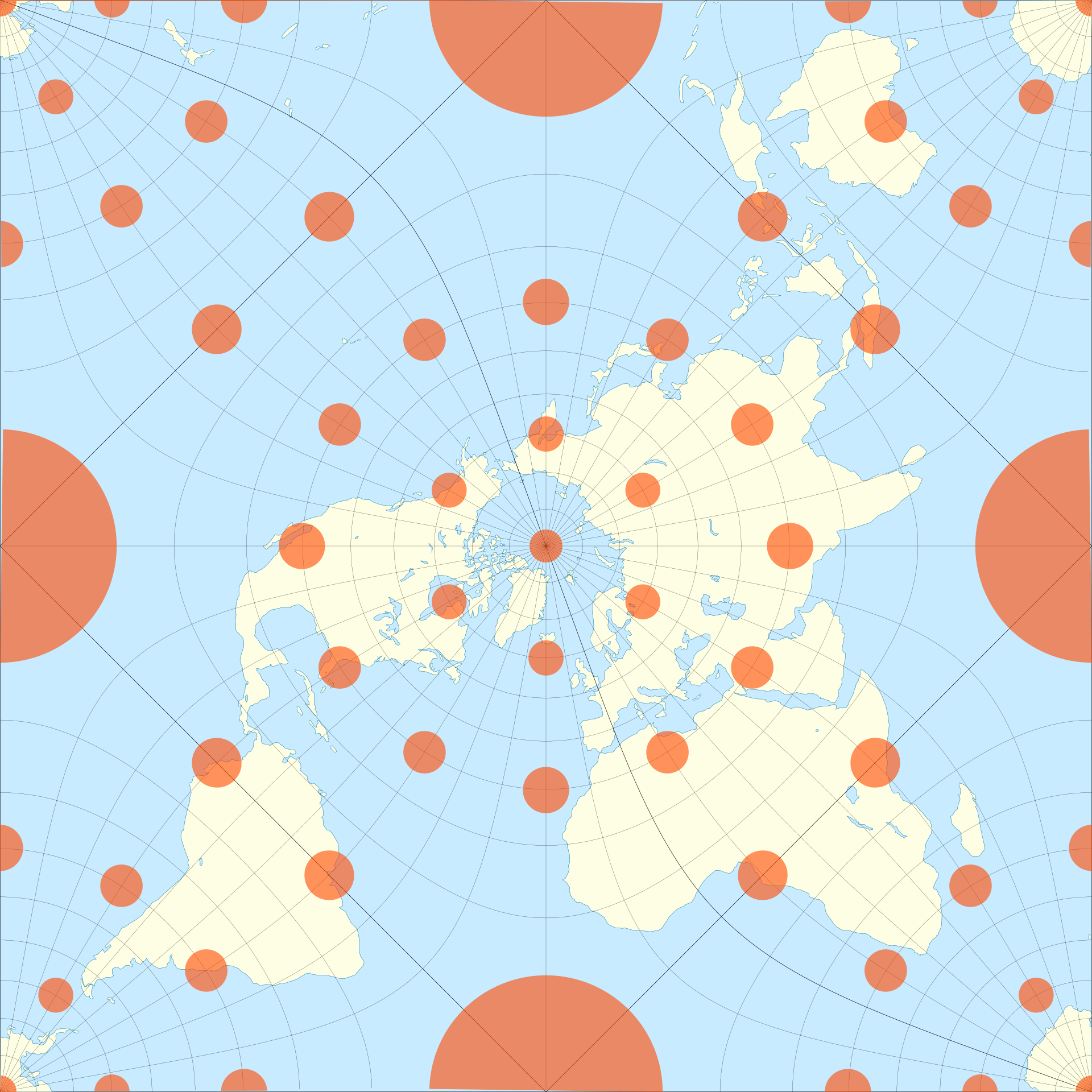
Other maps may try to preserve certain distances, instead of lengths or angles. The Azimuthal Equidistant projection shows the correct distance from the north pole to any point on the map, while distorting both angles and areas. One particularly egregious distortion: the south pole is mapped to an entire ring (a circle of constant distance from the north pole), an unfortunate feature causing some people on the internet to take this map literally, and claim there is a great ice wall surrounding our disk shaped world.


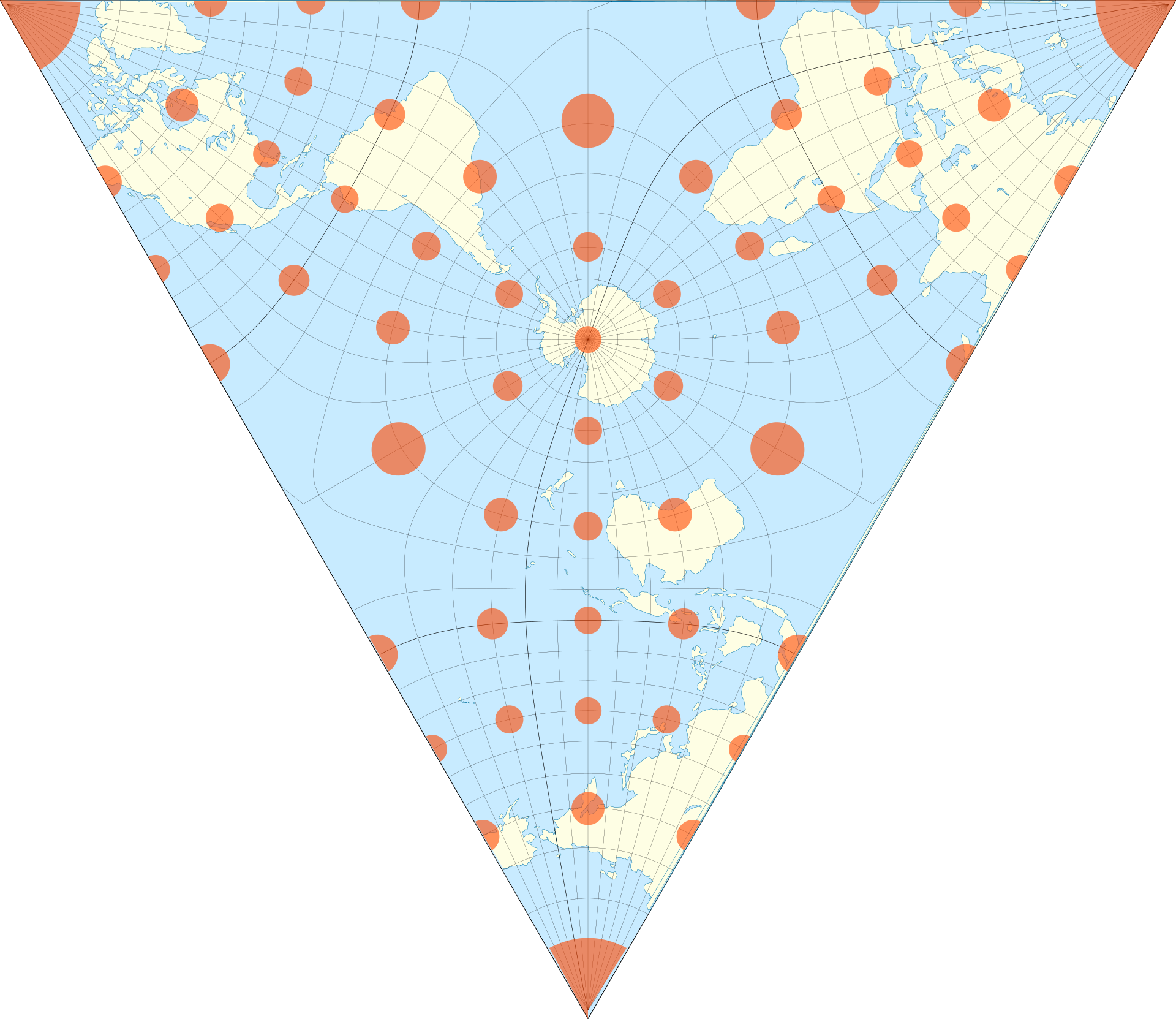
So far, all the maps we’ve looked at have tried to depict the earth in some reasonable shaped region of the plane, and just live with the resulting distortion. But one can instead try to as best preserve angle and area as possible, and instead distort the shape of the map itself. Notable maps in this family include the tetrahedral projection,
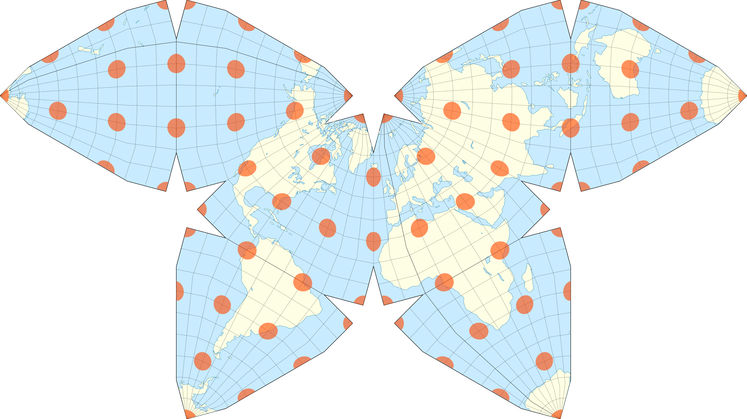
as well as the Waterman projection, based on a truncated octahedron
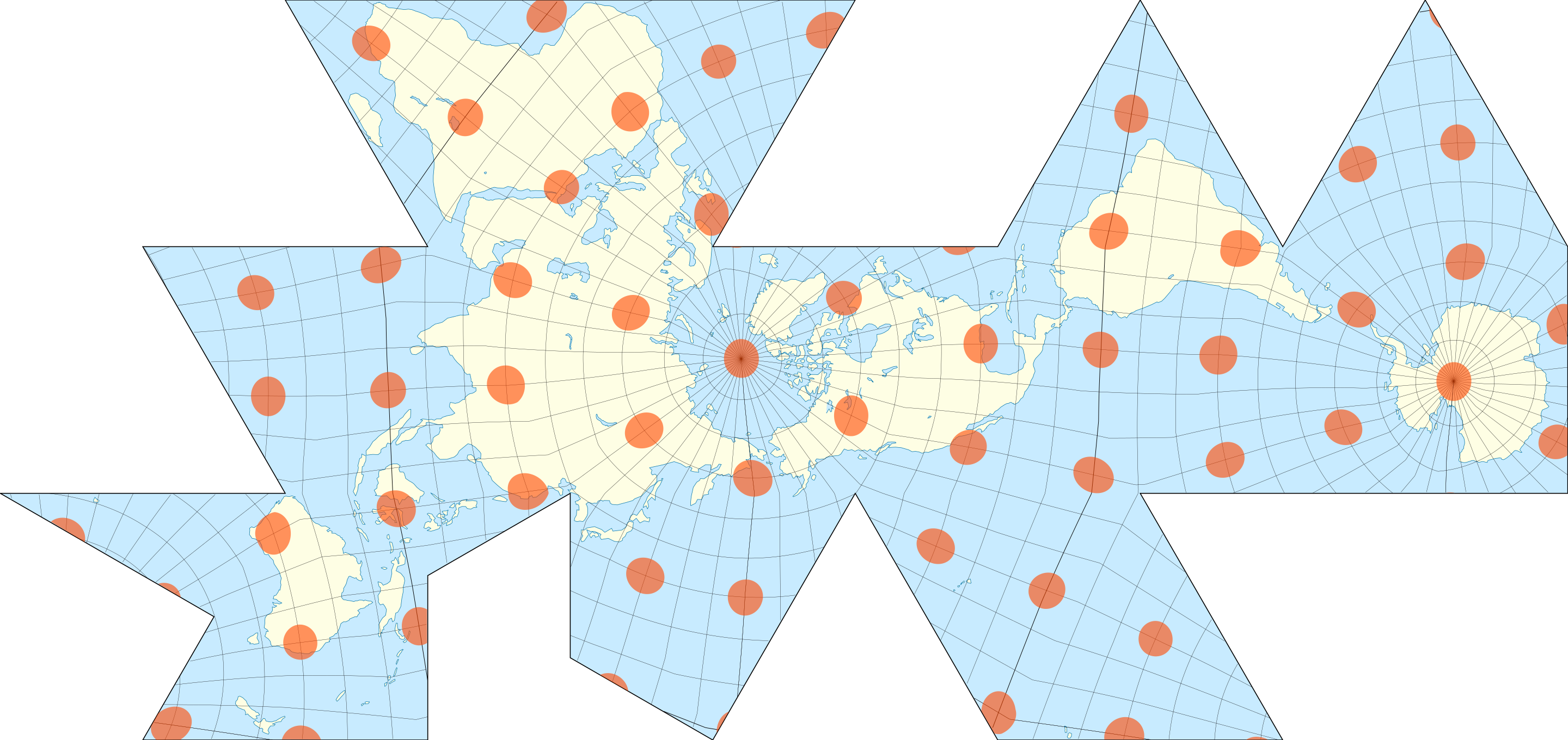
or the even wilder Dymaxion projection
21.2 Foundations
Alright - so we’ve now seen a bunch of maps, and spent some time thinking about how to interpret them. But how do we make this subject mathematical? To do mathematics we need definitions, and so the first thing we have to do is figure out abstractly, what is a map. What features are in common to all of the examples above?
One thing they all have in common is that they are all represented by some region in the Euclidean plane. The other fundamental commonality is that each point in that region represents some unique point of the sphere. Mathematically, pairings of points of one space uniquely with points of another space are modeled by a certain type of function: a bijection. So a map is a function!
Definition 21.1 (Map) A map is a region \(R\subset\SS^2\) of the sphere, and a subset \(M\subset\EE^2\) of the Euclidean plane, together with a bijection \(\phi\colon R\to M\). We call this map a chart, and we call the image of \(M=\phi(R)\) the map of \(R\) via the chart \(\phi\).

So, charts are functions that take pieces of the sphere and flatten them out onto pieces of the plane. But charts are (by definition) invertible, and so their inverse is a function which takes a region in the plane and presses it onto the sphere. Going this direction is also quite useful, so we’ll give these a name, and call them parameterizations.
Definition 21.2 (Parameterization) A parameterization of a region \(R\subset\SS^2\) is an invertible function \(\psi\colon M\to \SS^2\) from some map \(M\subset\EE^2\) onto \(R\subset\SS^2\).
The inverse of any chart is a parameterization, and the inverse of any parameterization is a chart. For this course, we will restrict our study to maps for which both the chart and parameterization are continuous and differentiable, so we can do geometry with infinitesimal vectors! In mathematics more generally, such maps are called diffeomorphisms.
Because the earth is a sphere and the plane is…not a sphere, its actually impossible to make a map which depicts every single point of the earth continuously. (This is readily believable, if you try to imagine continuously flattening a sphere onto the plane so no two points overlap, but its formal proof requires the subject of topology) Oftentimes, we are able to depict most of the earth (say, except for single lines or points where we cut it), and this causes no major issues. But if you insist on having a map of every point on the sphere, you need more than one map. Mathematicians call such a collection an atlas.
Definition 21.3 (Atlas) An atlas is a collection of maps such that each point \(p\in\SS^2\) is in the domain of the chart of at least one of the maps.

We will not have a need to consider atlases in this brief chapter, but they play a large role in the theoretical foundations of mathematical map-making: the subject known as Riemannian geometry.
Here, our goals are straightforward: given a map \(M\) with chart \(\phi\) and parameterization \(\phi\), we want to be able to compute true things about the sphere, using only the two dimensional map \(M\). To do so, we’ll treat \(\phi\) and \(\psi\) as translation devices taking us between the map and the actual sphere, and calculus to get quantitative results.
21.3 Getting Quantitative
The goal of a map is to compute in \(M\) but learn about \(\SS^2\). We want to take a curve in \(M\), and figure out how long the curve it represents on the sphere is. If two curves in in our map intersect (say, the path of two roads) we want to figure out what angle they intersect at on the sphere, while only measuring things using angles and vectors in \(M\). And so on…

21.3.1 Lengths
Probably unsurprisingly at this point in the course, the solution to all these problems is to zoom in, and use calculus to answer these things. This lets us replace the problem of curve lengths with infinitesimal lengths.
Proposition 21.1 If \(\gamma\colon [a,b]\to M\) is a curve drawn in a map \(M\), then its map-length (the length of the curve it represents on the sphere) can be computed as \[\mathrm{maplength}(\gamma)=\int_a^b\|D\psi_{\gamma(t)}\gamma^\prime(t)\|dt\]
Proof. This is just a direct computation with the chain rule! If \(\gamma\) is a curve in \(M\), then we can use the parameterization \(\psi\) to move it onto \(\SS^2\), so we get the true curve \(\psi(\gamma(t))\) on the sphere. Now, we can compute the length of this - which is what we actually want!
\[\begin{align*}\mathrm{maplength(\gamma)}&:=\len (\psi\circ\gamma)\\ &=\int_a^b\left\|\left(\psi(\gamma(t))\right)^\prime\right\|,dt\\ &=\int_a^b\left\|D\psi_{\gamma(t)}\gamma^\prime(t)\right\|\,dt \end{align*}\]
Thus, the fundamental quantity we need to be able to compute is the map-length of an individual vector: given a vector \(v\in T_pM\), find out how long of a vector it really represents on the sphere.
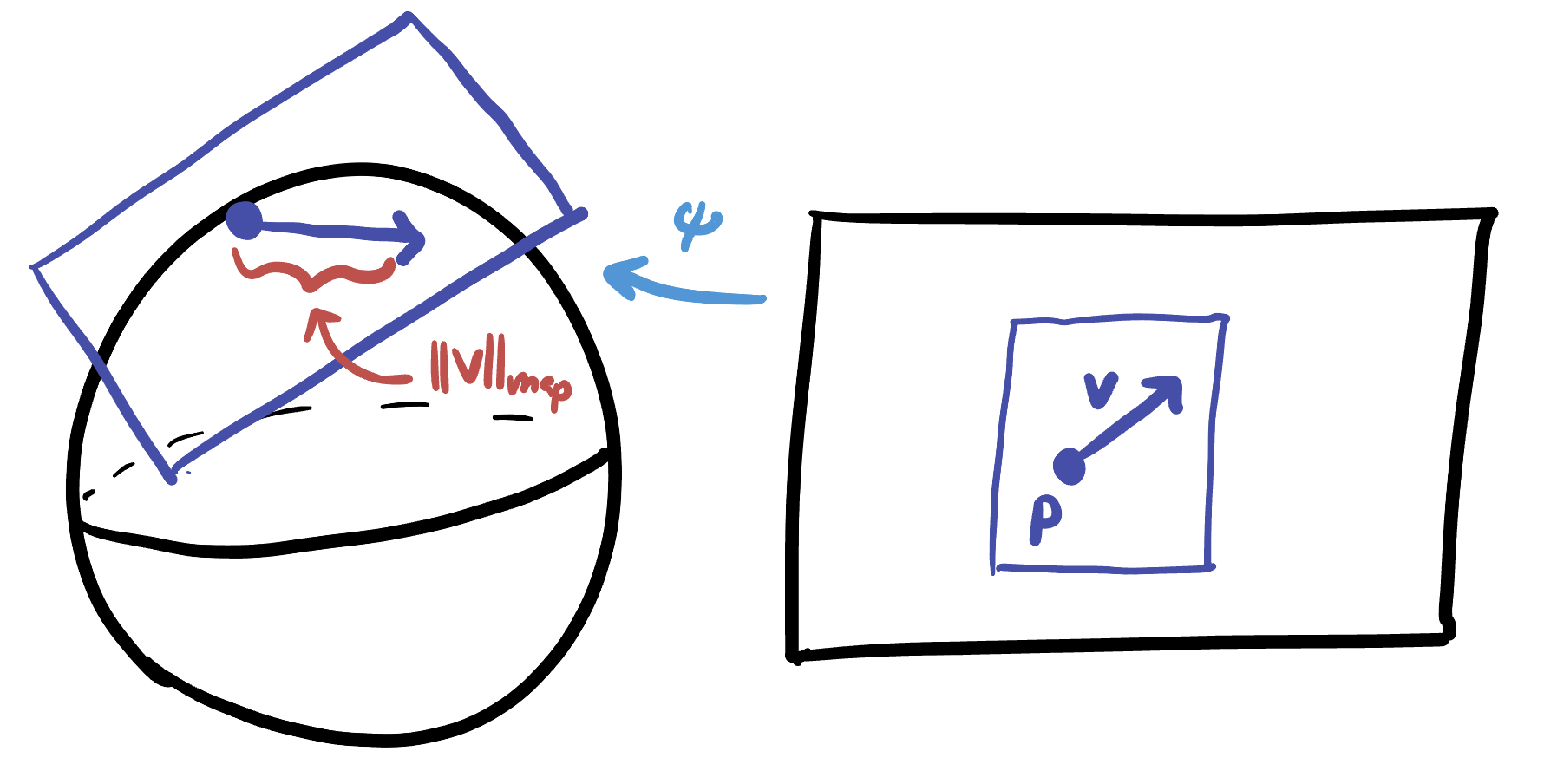
Definition 21.4 Let \(M\) be a map of a region of the sphere with parameterization \(\psi\colon M\to \SS^2\). If \(v\in T_pM\) then the map-length of \(v\) is given by \[\|v\|_{\mathrm{map}}=\|D\psi_p(v)\|_{\EE^3}\]
Once we can compute infinitesimal lengths like this, not only have we solved the problem of finding the length of a curve on a map, but we can also draw the Tissot Indicatrices! Tissot imagined these as small disks at each point, and we can model them precisely as infinitesimal disk in the tangent space.
Definition 21.5 (Map Disk) At each point \(p\in M\), the map disk is the set of all tangent vectors \(v\) of maplength less than or equal to \(1\). We will denote this disk \(\DD^2_{\map}(p)\):
\[\DD^2_\map(p)=\left\{v\in T_pM\mid \|v\|_\map \leq 1\right\}\]

21.3.2 Angles
We can similarly compute angles in a map, first use the parameterization to take us back to the sphere, and then measure the ‘true’ angle value there.
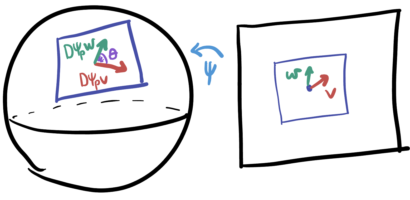
Proposition 21.2 (Map Angle) Let \(M\) be a map of some region of the sphere, with parameterization \(\psi\). If \(v,w\) are two tangent vectors based at \(p\in M\), their map angle is given by \[\theta_\map = \arccos\left(\frac{(D\psi_pv)\cdot (D\psi_p w)}{\|D\psi_p v\|\|D\psi_p w\|}\right)\]
Proof. This is just the Euclidean formula for angles,
\[\theta = \arccos\left(\frac{V\cdot W}{\|V\|\|W\|}\right)\]
on the (EUclidean) tangent space to \(\SS^2\) in \(\EE^3\), applied to the vectors \(V=D\psi_p v\) and \(W=D\psi_p w\), which are the result of moving our vectors from the map to the sphere with \(\psi\).
21.3.3 Areas
Finally, how do we calculate map area? Again - we can think infinitesimally, and ask what happens to infinitesimal areas, and then integrate the result. An infinitesmial aread \(dA\) in the Euclidean plane can be thought of as an infinitesimal unit square with sides \(dx=\langle 1,0\rangle\in T_pM\) and \(dy=\langle 0,1\rangle\in T_pM\) along the \(x\) and \(y\) directions respectively.

But such a unit square might not represent a unit area on the sphere! Think about the mercator projection: if this little square were near the north or south pole, mapping it onto the sphere would shrink it a lot (as projecting from the earth to the map increases size near the poles), so this square would actually represent a small area. (Indeed, we will see later that the area of an infinitesimal unit square in the Mercator projection at latitude \(\theta\) is actually \(\cos^2\theta\), which is very small near the poles \(\theta=\pm\tfrac{\pi}{2}\))
To calculate the infinitesimal map area \((dA)_{\map}\), we need to push the unit basis vectors \(e_1=\langle 1,0\rangle\) and \(e_2=\langle 0,1\rangle\) in \(T_pM\) to the sphere using \(\psi\), and then measure the area that their images span in the tangent space \(T_{\psi(p)}\SS^2\).
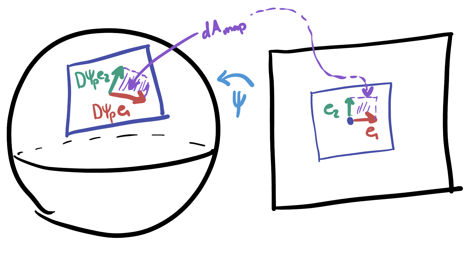
Such an area is rather annoying to measure in general, as the vectors \(D\psi_p e_1\) and \(D\psi_p e_2\) are both vectors with three coordinates. We know how to find the area spanned by two vectors in the plane, via the determinant (which we derived on homework way back in the calculus chapter!)
Definition 21.6 Let \(M\) be a map of some region of the sphere with parameterization \(\psi\), and \(e_1=\langle 1,0\rangle\), \(e_2=\langle 0,1\rangle\) the unit basis vectors in \(\EE^2\). The map-area at a point \(p\in T_pM\) is \[(dA)_\map = \|(D\psi_p e_1)\times(D\psi_p e_2)\|\,dxdy\]
Luckily, we will not often need to utilize the full generality of this definition. We will call a parameterization rectangular if it sends the \(x\) and \(y\) directions on \(M\) to pairs of orthogonal directions on \(\SS^2\). For these maps, we can avoid the use of the cross product all together:
Proposition 21.3 Let \(M\) be a map with rectangular parameterization \(\psi\). Then the infinitesimal area is given by \[(dA)_\map = \|D\psi_p e_1\|\|D\psi_p e_2\|\,dxdy\]
Proof. For maps with rectangular parameterizations, \(D\psi_p e_1\) and \(D\psi_p e_2\) are orthogonal to each other, and span a small rectangle in \(T_{\psi(p)}\SS^2\).
Because the area of a rectangle is hust base times height - we can simply transfer \(e_1\) and \(e_2\) to the sphere via \(\psi\), measure their lengths, and take the product:
\[e_1\mapsto D\psi_p e_1\hspace{1cm}e_2\mapsto D\psi_p e_2\] \[(dA)_\map = \|D\psi_p e_1\|\|D\psi_p e_2\|\,dxdy\]